Free study notes for every skill the exam measures, plus the books, courses and practice tests I recommend.
By Vlad CatrinescuMicrosoft MVP and MCT · Pluralsight Author
The PL-300 Study Guide helps you prepare for the Microsoft Power BI Data Analyst exam, the associate-level certification for turning raw data into clear, trustworthy Power BI reports.
Everything here lines up with the skills Microsoft measures: free Microsoft Learn paths and my own study notes for self-study, plus the books, courses and practice tests I recommend when you want more. No exam dumps, ever.
Exam length
100 min
Passing score
700 / 1000
Skills measured
4 domains, 78 skills
Guide reviewed
April 2026
Resources by the way you like to study
8 hand-picked, free and paid
Books
2 resources
Many learners prefer studying from books, which is why Microsoft continues to publish the Exam Ref series. Just keep in mind that books can lag behind exam updates, so always check the publication date and whether the skills measured changed since.
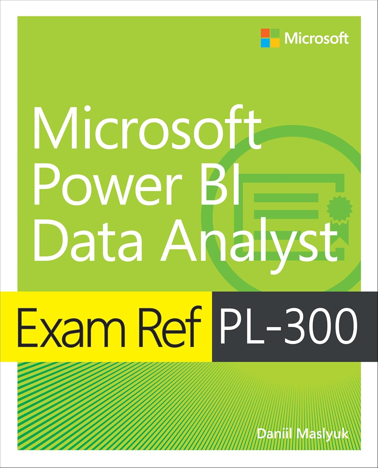
The Exam Ref PL-300 is the official Microsoft Press book for this exam, and it maps closely to the four skill areas you are studying.
Recommended
Exam Ref PL-300 Microsoft Power BI Data Analyst
Direct from Microsoft Press, the official study guide for the PL-300 exam. It works through preparing, modeling, visualizing and securing data in Power BI, with review questions that mirror how the exam frames each skill.
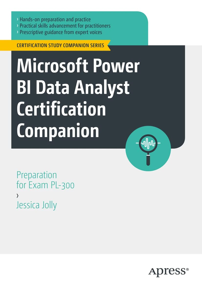
Microsoft Power BI Data Analyst Certification Companion: Preparation for Exam PL-300
Use this book to study for the PL-300 Microsoft Power BI Data Analyst exam. The book follows the “Skills Measured” outline provided by Microsoft to help focus your study. Each topic area from the outline corresponds to an area covered by the exam, and the book helps you build a good base of knowledge in each area. Each topic is presented with a blend of practical explanations, theory, and best practices.
On-demand training lets you learn at your own pace, on your own schedule: expert-led video courses from Pluralsight or Udemy, or hands-on modules from Microsoft Learn, whenever you need them.
Not all platforms are the same. Pluralsight relies on vetted authors and curated content, while marketplaces vary in quality. I only recommend courses that are highly rated and closely aligned with the skills you need, and I still encourage reading the course details and reviews before enrolling.
Recommended
Microsoft Power BI Data Analyst (PL-300)
Free trial
The Pluralsight path that covers every skill PL-300 measures, from Power Query and DAX to report design and workspace security. A strong start whether you are new to Power BI or filling gaps before the exam.
Here's Exactly How to Pass the PL-300 Power BI Exam
Free
A free, one-sitting walkthrough of the PL-300 exam from The Power BI Guy, covering how to approach each skill area. A useful orientation before you dive into the study notes and hands-on practice.
These are practice exams, not dumps. Dumps ruin the value of a certification for everyone. Practice tests are a great way to check you are ready once you have studied everything in this guide.
PL-300 Practice Assessment
Free
Microsoft's own free practice questions for PL-300, written in the same style as the exam. The best no-cost way to check where you stand before you book.
Microsoft Learn is a great free way to learn the PL-300 content. It is mostly text-based articles, with small quizzes at the end of every module.
The course syllabus below is Microsoft's own list of the learning paths and modules that cover the exam. When you want one topic rather than the whole curriculum, every skill in my study notes links the exact Microsoft Learn page for it.
Course PL-300T00-A: Design and manage analytics solutions using Power BI
Free
Microsoft's official PL-300 course page. The syllabus lists every Microsoft Learn path and module the course teaches, and all of them are free to work through at your own pace.
This is the Microsoft Official Course, which you can schedule at a Microsoft learning partner. The classes are presented by Microsoft Certified Trainers. It is the best way to learn any topic, since you can ask a live instructor questions, and also the most expensive one.
Course PL-300T00-A: Design and manage analytics solutions using Power BI
Instructor-led
The three-day Microsoft Official Course, delivered by a Microsoft Certified Trainer at a learning partner. It works through modeling, visualizing, analyzing and managing data in Power BI with guided labs.
Some links on this page are affiliate links. If you use them, I may earn a commission at no extra cost to you.
Skills measured and study notes
78 skills, free to study here
Built for the skills measured Microsoft published on 20 April 2026.
0 of 78 studied
The PL-300 exam covers four main skill areas. I have broken down every single skill below with explanations, key facts, and links to help you study. This is the same approach I use when preparing for Microsoft exams myself, and after helping IT professionals prepare for Microsoft certifications for years, I can tell you that understanding the skills measured is the single most important step.
Tip: The first three areas each carry roughly a quarter of the exam, so no single one lets you coast. Power Query and DAX show up across the whole exam, so time spent there pays off everywhere.
Domain 1Prepare the Data25-30% of the exam0 / 17 studied
This domain is all about Power Query: connecting to data wherever it lives, choosing how it is stored, and then profiling, cleaning, shaping and loading it so it is ready to model. Expect scenario questions where you pick the right connectivity mode or the right transformation for a messy column.
Get or connect to data
01
Identify and connect to data sources or a shared semantic model
Studied
Power BI connects to hundreds of sources through Get data, from files and folders to relational databases, online services and OData feeds. Instead of importing your own copy, you can also connect to an existing shared semantic model so many reports build on one governed dataset.
What you need to know
Get data groups sources into File, Database, Power Platform, Azure, Online Services and Other; Recent sources and OneLake data hub speed up common connections
A live connection to a Power BI semantic model or Analysis Services means the model lives elsewhere; you build visuals but cannot add tables or change the model
Connecting to a shared semantic model promotes reuse and a single version of the truth across many reports
Some connectors support query folding, which pushes your transformations back to the source for speed
Change data source settings, including credentials and privacy levels
Studied
Data source settings let you update where a query points and how it authenticates without rebuilding the query. Privacy levels tell Power Query whether data from two sources may be combined, which protects sensitive data from leaking into a public source.
What you need to know
Data source settings are reached from Transform data, and cover the sign-in credentials, the connection details and the privacy level per source
Credentials come in several kinds depending on the source: Windows, database username and password, Microsoft account, OAuth or a key
The three privacy levels are Private, Organizational and Public; Private is the most restrictive and never flows to another source
A privacy level mismatch, or setting Ignore privacy levels, can change results or break query folding
Exam tip: If two sources will be merged, their privacy levels decide whether the combine is even allowed, so know that Private data is never sent to a Public source.
03
Choose between DirectLake, DirectQuery, and Import
Studied
Storage mode decides where your data actually sits and when it is read. Import caches a compressed copy in the model, DirectQuery leaves the data at the source and queries it live, and Direct Lake reads Fabric OneLake data directly for near-import speed without a refresh.
What you need to know
Mode
Where data lives
Trade-off
Import
Cached in the model (VertiPaq)
Fastest queries and full DAX, but data is only as fresh as the last refresh
DirectQuery
Stays at the source
Always current and handles huge data, but slower and limits some DAX and features
Direct Lake
Fabric OneLake Delta tables
Near-import speed with no scheduled refresh, but Fabric-only
Import is the default and usually the best choice for performance
DirectQuery suits very large or highly volatile data, or where data cannot be copied
Composite models let one model mix Import and DirectQuery tables
Direct Lake is a Microsoft Fabric feature that reads Delta tables in OneLake
Parameters store a value you can reuse and change in one place, such as a server name, a file path or a filter value. They make a query portable across environments and drive features like incremental refresh.
What you need to know
Parameters are created and edited in Manage Parameters in the Power Query Editor
A parameter has a type and can take any value, a list of suggested values, or a query's output
Parameters can feed a data source path so you switch from dev to production by changing one value
Templates (.pbit) prompt for parameter values when opened, which is how you distribute a report that connects to each user's own source
Evaluate data, including data statistics and column properties
Studied
Before you trust data, you profile it. Power Query's data profiling tools show the shape and quality of each column so you can spot problems early, right inside the editor.
What you need to know
Column quality shows the percentage of valid, error and empty values in a column
Column distribution shows how many distinct and unique values a column holds
Column profile gives per-column statistics (min, max, average, counts) and a value distribution chart
By default profiling is based on the top 1,000 rows; you can switch it to the entire data set at the bottom of the window
Exam tip: Remember that profiling defaults to the top 1,000 rows; switch to the whole data set when a quality problem might hide further down.
06
Resolve inconsistencies, unexpected or null values, and data quality issues
Studied
Real data is messy: inconsistent casing, stray whitespace, wrong or missing values. Power Query gives you targeted transformations to standardize and repair columns so downstream calculations are reliable.
What you need to know
Replace values swaps a specific value for another; Replace errors turns error cells into a chosen value such as null or zero
Fill Down and Fill Up copy a value into adjacent null cells, useful after unpivoting or with merged-cell sources
Format transforms handle Trim, Clean, and casing (lowercase, UPPERCASE, Capitalize Each Word)
Remove Duplicates, Remove Blank Rows and filtering out unwanted values clean the row set
Keep the source data unchanged: every fix is a recorded, repeatable Applied Step
Import errors happen when a value cannot fit a column's data type, when a source changes, or when a step references something that no longer exists. Knowing where errors surface and how to handle them keeps a refresh from failing.
What you need to know
Cell-level (value) errors come from failed type conversions and show as Error in the cell; step-level errors stop the whole query
Keep Errors and Remove Errors let you isolate or discard bad rows; Replace Errors substitutes a safe value
A common cause is setting a data type too early, before a text value is cleaned
Renamed or deleted source columns break steps that reference them by name
Every column has a data type, and it drives how values sort, aggregate and behave in DAX. Setting the right type early prevents subtle errors and keeps model size down.
What you need to know
Common types include Decimal number, Fixed decimal number (currency), Whole number, Date, Date/time, Text, True/false and Binary
Fixed decimal number stores four decimal places and avoids the rounding surprises of floating point, so it suits money
The type icon sits in each column header; setting a type adds a Changed Type step
Use Using Locale when a date or number is written in a different regional format
You reshape columns to fit the model: splitting, extracting, deriving and formatting. Power Query offers ready-made transforms plus custom columns for anything the ribbon does not cover.
What you need to know
Custom Column builds a new column from an M expression using other columns
Column from Examples infers the transformation from a few values you type
Conditional Column creates if/then/else logic without writing M
Split Column (by delimiter, number of characters or position) and Extract (before, after, between) break text apart
Prefer a Power Query column for anything that can be computed at load; save DAX calculated columns for model logic
Group By collapses rows that share a value into summary rows, computing counts, sums, averages and more. It is how you change the grain of a query, for example from one row per sale to one row per product.
What you need to know
Group By supports Sum, Count, Count Distinct, Average, Min, Max and All Rows
Basic grouping uses one column; Advanced grouping adds more columns and more aggregations at once
The All Rows aggregation keeps the underlying rows as a nested table for later expansion
Grouping reduces row count and can shrink the model, but it also changes the grain, so do it deliberately
Pivoting and unpivoting move data between wide and tall shapes. For analytics you almost always want tall (unpivoted) data, because a column per category is hard to model.
What you need to know
Unpivot turns columns into attribute/value pairs (tall data), ideal for a model; Unpivot Other Columns keeps chosen columns fixed
Pivot does the reverse, turning row values into columns, which you rarely want for a model
Transpose flips rows and columns wholesale, handy when headers arrive as a row
Unpivot Other Columns is the resilient choice because it still works when new period columns are added later
Exam tip: When a source has one column per month and new months keep appearing, Unpivot Other Columns survives the change while a fixed Unpivot does not.
12
Convert semi-structured data to a table
Studied
Sources like JSON, XML and nested API responses arrive as records and lists rather than a flat table. Power Query expands these structures into rows and columns you can work with.
What you need to know
A Record is a single set of fields; a List is a set of values; both appear as clickable links in a cell
Expand adds a record's fields as new columns; Expand to New Rows turns a list into rows
The JSON and XML connectors return nested structures you drill into with these expand steps
Convert a List to a table with To Table before you can transform it further
A well-shaped model separates facts (the events you measure) from dimensions (the things you slice by). Building these tables in Power Query sets you up for a clean star schema in the model.
What you need to know
A fact table holds measurements and foreign keys, is long and narrow, and grows over time (Sales, Orders)
A dimension table describes an entity, is shorter and wider, and holds the attributes you filter and group by (Product, Customer, Date)
Reference queries let you build several dimensions from one source query
Duplicate and Remove Duplicates on a key column is a common way to carve a dimension out of a fact source
Identify when to use reference or duplicate queries and the resulting impact
Studied
Duplicate and Reference both spin a new query off an existing one, but they behave very differently, and the difference affects refresh and maintenance.
What you need to know
Duplicate copies every step into an independent query; later edits to the original do not affect the copy
Reference creates a new query that starts from the output of the original, so it inherits later changes
Reference is the tool for building several tables from one cleaned base query (staging queries)
A referenced source may be evaluated more than once at refresh unless the source query is loaded or folding applies
Exam tip: Merge adds columns (a join), Append adds rows (a union). Watch the wording of the scenario to pick the right one.
16
Identify and create appropriate keys for relationships
Studied
Relationships need a matching column on each side, and it works best when one side has unique values. Preparing clean keys in Power Query avoids ambiguous or broken relationships in the model.
What you need to know
A dimension's key should be unique with no blanks; the fact side holds the matching foreign key
When no single column is unique, create a composite key by merging columns (for example Region plus Store)
Keys must share a data type on both sides for the relationship to work
Blank or duplicate keys on the one side cause relationship errors or an unexpected many-to-many
Domain 2Model the Data25-30% of the exam0 / 16 studied
This domain is where a pile of tables becomes a semantic model: relationships, a date table, DAX measures and calculation groups, then tuning it to run fast. A solid grasp of the star schema and of how filters flow through relationships underpins almost every question here.
Design and implement a data model
18
Configure table and column properties
Studied
Beyond names and data types, tables and columns carry properties that change how they behave in reports: how they sort, how they summarize, and how visuals treat them. Setting these once in the model saves work in every report built on it.
What you need to know
Sort by column makes one column sort by another, most often a month name sorted by a month number
Data category (Address, City, Web URL, Image URL, and so on) tells visuals how to treat a column, which drives maps and image display
Default summarization sets whether a numeric column sums, averages or does not aggregate; set numeric keys to Do not summarize
Hiding technical columns (keys, helper columns) keeps the Fields pane clean for report authors
A role-playing dimension is one dimension used several times for different roles, the classic case being a Date table joined to Order Date, Ship Date and Due Date. You keep one physical table and switch which relationship is active in a calculation.
What you need to know
Only one relationship between two tables can be active at a time; the others are inactive (dashed line)
USERELATIONSHIP activates an inactive relationship for a specific measure
The alternative is to import the dimension more than once (one table per role), which uses more model space
Role-playing keeps a single date table and a single set of attributes, which is cleaner to maintain
Define a relationship's cardinality and cross-filter direction
Studied
Every relationship has a cardinality (how the keys match up) and a cross-filter direction (which way filters travel). Getting these right is the single biggest driver of correct results.
The four cardinalities:
One-to-many (1:*): the most common; one row on the dimension side matches many on the fact side
Many-to-one (*:1): the same thing viewed from the fact side
One-to-one (1:1): each row matches exactly one row on the other side
Many-to-many (:): neither side is unique; use with care, it can produce ambiguous results
Cross-filter direction is Single (filter flows from the one side to the many) or Both (bidirectional)
Single direction is the default and the safe choice; Both can create ambiguity and performance cost
Bidirectional filtering is sometimes needed for many-to-many scenarios and certain slicer patterns
Exam tip: Default to one-to-many with single cross-filter direction; reach for Both or many-to-many only when a scenario truly needs it, and know the ambiguity risk it brings.
21
Create a common date table
Studied
Time intelligence in DAX needs a proper date table: one row per day, a contiguous range with no gaps, marked as the model's date table. Reusing one date table across every date relationship keeps calculations consistent.
What you need to know
A date table has one continuous row per date covering every date used in the data, with no missing days
Mark as date table tells Power BI which table to use for time intelligence and requires a unique date column
You can build one with CALENDAR or CALENDARAUTO in DAX, in Power Query, or from a source
CALENDARAUTO scans the model for the min and max dates automatically
Add columns like Year, Quarter, Month and Month Number so visuals sort and group correctly
Identify use cases for calculated columns and calculated tables
Studied
Calculated columns and tables are computed with DAX after the data loads. They have their place, but they are not always the right tool, and the exam tests whether you know when to use each.
What you need to know
A calculated column is evaluated row by row at refresh and stored in the model, so it costs memory
Prefer a Power Query custom column over a calculated column when the value can be computed at load
A measure is usually better than a calculated column when you need an aggregation that responds to filters
Calculated tables suit model-only helpers: a date table, a role-playing copy, or a bridge table
Calculated columns can be used as slicers, on an axis, or in a relationship; measures cannot
Measures are DAX calculations evaluated in the filter context of a visual. A single aggregation measure wraps one aggregation function, and it is the workhorse of most reports.
What you need to know
SUM, AVERAGE, MIN, MAX and COUNT aggregate a single column; COUNTROWS counts rows of a table
DISTINCTCOUNT counts unique values, common for counting customers or orders
A measure recalculates for every cell based on the filters that apply there (filter context)
Measures do not consume storage the way calculated columns do; they compute at query time
Write measures explicitly rather than dragging a column into a visual, so the logic is reusable and named
CALCULATE is the most important function in DAX because it can change the filter context in which a measure is evaluated. Almost every non-trivial measure uses it.
What you need to know
CALCULATE(expression, filter1, filter2, ...) evaluates the expression after applying the filters you give it
Its filter arguments can add, replace or remove filters on the current context
REMOVEFILTERS (or ALL) inside CALCULATE clears filters, which is how you compute a percentage of total
KEEPFILTERS preserves existing filters instead of overwriting them
CALCULATE also turns a row context into a filter context (context transition), which matters inside iterators
Exam tip: When a measure needs to ignore a slicer or compute a share of total, that is CALCULATE with ALL or REMOVEFILTERS.
25
Implement time intelligence measures
Studied
Time intelligence answers the questions every business asks: year-to-date, last year, and change over time. DAX has a family of functions for it, and they all rely on a marked date table.
What you need to know
TOTALYTD, TOTALQTD and TOTALMTD give running totals within a year, quarter or month
SAMEPERIODLASTYEAR and DATEADD shift a period for prior-period comparison
DATESYTD and DATESINPERIOD return date tables you use inside CALCULATE
These functions require a continuous date table marked as the date table
Year-over-year change is typically a measure minus its SAMEPERIODLASTYEAR value, divided by that value
Exam tip: Use DIVIDE instead of the / operator so a divide-by-zero returns blank rather than an error.
27
Create semi-additive measures
Studied
Some values should not be summed across time: an account balance or an inventory count at month end is a point-in-time figure. These are semi-additive, and they need special handling over the date dimension.
What you need to know
Additive measures sum across every dimension (sales); non-additive never sum meaningfully (a ratio); semi-additive sum across some dimensions but not time
Typical semi-additive values are stock levels, headcount and account balances
LASTNONBLANKVALUE, CLOSINGBALANCEMONTH and OPENINGBALANCEMONTH return the right point-in-time value
The pattern is usually the last (or first) value in the period rather than a sum of the period
Quick measures build common DAX for you from a dialog, then leave the generated formula so you can learn from it or tweak it. They are a fast, error-free way to get standard calculations.
What you need to know
Quick measures cover categories like totals, averages per category, running and moving aggregates, time intelligence, and running totals
The dialog produces real DAX you can read and edit afterward
Some quick measures can be generated with Copilot or from a natural-language prompt
They are a good learning tool for seeing how CALCULATE and iterators are used in practice
Calculated tables and columns are defined with DAX and materialized in the model. They solve modeling problems that Power Query cannot, because they can reference the whole model and other DAX.
What you need to know
A calculated table is created from a DAX table expression such as CALENDAR, FILTER, SUMMARIZE, UNION or DISTINCT
Common uses are a date table, a role-playing dimension copy, or a bridge table for many-to-many
Calculated tables and columns refresh with the model and add to its size
They can reference measures and other tables, which Power Query cannot do
Calculation groups apply one set of calculations (like time intelligence) across many measures without you writing the same variations for each. They cut down measure sprawl dramatically.
What you need to know
A calculation group holds calculation items, each a DAX expression that uses SELECTEDMEASURE()
One time-intelligence calculation group (YTD, PY, YoY %) can apply to every measure in the model
They are created in the model view (or in external tools like Tabular Editor) and appear as a table with a single column
Calculation item order matters and is controlled by an ordinal property
They reduce the number of explicit measures you must build and maintain
Identify poorly performing measures, relationships, and visuals by using Performance Analyzer and DAX query view
Studied
When a report is slow, you need to find the culprit rather than guess. Performance Analyzer times each visual, and DAX query view lets you test and tune the queries behind them.
What you need to know
Performance Analyzer records how long each visual takes, split into DAX query, visual display and other
A long DAX query time points at the measure; a long visual display time points at the visual or too much data
Copy query from Performance Analyzer gives you the exact DAX a visual runs
DAX query view (in Power BI Desktop) runs DAX queries against the model to test and refine measures
Bidirectional relationships, complex measures and too many visuals on a page are common slow points
Granularity is how detailed the data is. Storing data at a finer grain than you ever report on wastes memory and slows queries, so pre-aggregating can help.
What you need to know
Grain is the level of detail of one row (per transaction, per day, per month)
Group and aggregate in Power Query, or use a summary table, when reports never need the row-level detail
Aggregations tables can sit over a DirectQuery model so common queries hit a small cached summary
Lower granularity means fewer rows, smaller model and faster visuals, at the cost of drill-down detail
Domain 3Visualize and Analyze the Data25-30% of the exam0 / 30 studied
This domain is the biggest by skill count. It covers building reports (choosing and formatting visuals, including the newer Copilot-assisted ones), making them interactive and accessible for real users, and using Power BI's analytical and AI features to find patterns. Hands-on time in Power BI Desktop is the fastest way to make these questions feel obvious.
Create reports
34
Select an appropriate visual
Studied
Choosing the right visual for the question is a core analyst skill, and the exam tests it directly. Each visual answers a different kind of question, so matching the visual to the data relationship matters.
What you need to know
Comparison across categories: bar and column charts
Trend over time: line and area charts
Part-to-whole: pie, donut, treemap, and stacked charts (use sparingly)
Relationship between measures: scatter chart
A single number against a target: card, KPI, and gauge
Exam tip: A scatter chart is the go-to for showing the relationship between two (or three) numeric measures; a line chart is for a measure over time.
35
Format and configure visuals
Studied
The Format pane controls how a visual looks and behaves, from colors and labels to axis and header settings. Consistent formatting is what separates a polished report from a rough one.
What you need to know
The Format (paintbrush) pane splits into Visual settings and General settings (position, title, background, border)
Data labels, legend, axis titles, and gridlines are all toggled and styled here
The X and Y axis can be set to a fixed range, log scale, or a custom start and end
Conditional formatting can drive colors, and settings can be copied between visuals with Format painter
The narrative (smart narrative) visual writes a plain-language summary of what a report or visual shows, and Copilot can generate and update it for you. It turns numbers into sentences that update as filters change.
What you need to know
The narrative visual produces dynamic text that responds to filters and slicers
Copilot can generate the summary and let you add your own prompts for specific points
You can insert dynamic values into the text so figures stay current
It is useful for executive summaries and accessibility, giving a written read-out of the data
A report theme applies a consistent set of colors and default formatting across every visual in one place. It is the fastest way to brand a report and keep it uniform.
What you need to know
Themes are applied from View > Themes; Power BI ships built-in themes and accepts custom ones
A custom theme is a JSON file defining the color palette, fonts, and default visual formatting
Customize current theme edits colors and text without leaving Power BI Desktop
Theme colors flow into the visual color pickers as the report's palette
Slicers and the Filters pane both narrow the data a report shows, but they work differently and suit different needs. Knowing the filter scopes is heavily tested.
What you need to know
A slicer is an on-canvas visual users click; the Filters pane is a side panel with more filter types
Filter scopes are visual-level, page-level, and report-level, from narrowest to broadest
Filter types include basic, advanced (conditions), and Top N
Drillthrough filters and the sync of slicers across pages extend filtering further
The Filters pane can be hidden, locked, or reordered for report consumers
Copilot can build a report page for you from a prompt, choosing visuals that answer the question you describe. It is a fast starting point you then refine.
What you need to know
Copilot can generate a full page of visuals based on a natural-language request or the model's content
It uses the semantic model's tables, fields, and measures to decide what to show
Generated pages are editable like any other, so you tune the visuals afterward
Copilot in Power BI generally requires a paid capacity (Fabric or Premium) to be enabled
Paginated reports are the pixel-perfect, print-ready format built with Power BI Report Builder. They serve a different need from interactive reports, and knowing when to choose them is tested.
What you need to know
Paginated reports are designed to print or export cleanly across many pages (invoices, statements, operational lists)
They can render every row of a large table, unlike an interactive visual that summarizes
They are built in Power BI Report Builder, not Power BI Desktop, and use RDL
They support precise layout, headers and footers, and export to PDF, Excel, and more
Exam tip: When the requirement is a print-perfect, multi-page document that shows every row, that is a paginated report, not a standard Power BI report.
44
Create visual calculations by using DAX
Studied
Visual calculations are DAX added directly to a visual, computed on the visual's result rather than stored in the model. They make once-hard calculations like running totals and moving averages simple.
What you need to know
A visual calculation operates on the data already in the visual, so it can reference other rows in that visual
Functions like RUNNINGSUM, MOVINGAVERAGE, and PREVIOUS work on the visual's axis
Visual calculations are simpler to write than the equivalent model measures and add no model size
They are edited in a dedicated visual calculations edit mode on the visual
By default, selecting a value in one visual filters the others. Edit interactions lets you control exactly how each visual reacts, which is key to a clean report.
What you need to know
The three interaction behaviors are Filter, Highlight, and None
Edit interactions (on the Format ribbon) shows an icon on every other visual so you set each one
How a visual is sorted changes the story it tells. Power BI sorts by a field, and you can control direction and even sort by a field that is not displayed.
What you need to know
Use More options (...) > Sort axis (or Sort by) to choose the field and direction
A visual can sort by a column that is not shown in the visual
Sort by column at the model level fixes categorical sort order, such as months in calendar order
Sorting set in Desktop is saved with the report; consumers can re-sort in the service
Configure drillthrough navigation, including pages, filters, and buttons
Studied
Drillthrough sends a user from a summary visual to a detail page filtered to the item they chose. It is the standard pattern for summary-to-detail exploration.
What you need to know
Add a field to the Drillthrough well of a target page to make it a drillthrough destination
Right-clicking a data point offers Drill through to the target, carrying that item's filter
A back button is added automatically and returns the user to where they came from
Cross-report drillthrough can jump to a page in a different report in the same workspace
Keep all filters passes the source page's filters along with the drillthrough
Enable personalization in a report, including personalized visuals
Studied
Personalize visuals lets consumers change a visual (its fields, visual type, and more) for their own view without edit rights, and without changing the report for others.
What you need to know
Turn on Personalize visuals in report settings (File > Options or the service report settings)
Consumers can swap the visual type, change measures and dimensions, and adjust the legend for their own session
Personal changes can be saved as a personal bookmark; they never affect the published report
It reduces the need for many near-identical report variants
Design and configure Power BI reports for accessibility
Studied
Accessible reports work for everyone, including keyboard and screen-reader users. Power BI has built-in features and design practices the exam expects you to know.
What you need to know
Set tab order in the Selection pane so keyboard navigation follows a logical path
Add alt text to visuals so screen readers can describe them
Do not rely on color alone; use labels, markers, and sufficient contrast
Themes include accessible color palettes; the narrative visual gives a text read-out
Report readers can navigate visuals and access a data table view with the keyboard
Power BI can explain changes in your data automatically. The Analyze feature runs statistical analysis on a data point so you do not have to slice manually.
What you need to know
Right-click a data point and choose Analyze to Explain the increase or Explain the decrease
Find where the distribution is different surfaces categories that behave unlike the rest
Power BI generates ready-made visuals explaining the change, which you can pin to the report
It works on visuals with a measure and a category or time axis
Grouping, binning, and clustering all collapse detail into meaningful buckets, but for different data. They help turn granular values into readable categories.
What you need to know
Grouping combines chosen categorical values into a single group (for example, several small regions into Other)
Binning buckets a numeric or date field into equal-size ranges (bins), such as age ranges
Clustering uses a machine-learning grouping on a scatter chart to find natural clusters
Groups and bins appear as new fields you can use like any other
Power BI ships AI-powered visuals that surface insights without DAX: the Key influencers, Decomposition tree, and Q&A visuals each answer a different analytical question.
Key influencers: shows what factors most affect a chosen metric, ranking the drivers behind an outcome.
Decomposition tree: breaks a measure down across dimensions interactively, and can auto-pick the next most significant split (AI splits: High value, Low value).
Q&A visual: lets users type a natural-language question and returns a visual answer from the model.
These visuals depend on a well-modeled, well-named semantic model to give good answers
Key influencers can analyze both categorical outcomes and continuous measures
Q&A quality improves with synonyms and a clean model
Domain 4Manage and Secure Power BI15-20% of the exam0 / 15 studied
This domain moves from Power BI Desktop into the Power BI service: workspaces, apps and dashboards, how you distribute content, keeping data fresh through gateways and scheduled refresh, and locking it down with workspace roles, row-level security and sensitivity labels. It is the lightest domain by weight, but security details are precise and easy to test.
Create and manage workspaces and assets
64
Create and configure a workspace
Studied
Workspaces are the containers in the Power BI service where you collaborate on reports, semantic models, dashboards and other items before you distribute them. Understanding workspaces is the foundation of the whole service.
What you need to know
A workspace holds related items: semantic models, reports, dashboards, dataflows and more
My workspace is personal; shared workspaces are for team collaboration and app publishing
Workspace settings cover the name, description, contacts, and the OneDrive/SharePoint location
Publishing an app is done from a workspace, so a workspace is the unit you build and then share
An app is a polished, read-only package of selected content published from a workspace to a broad audience. It is the recommended way to distribute to many consumers.
What you need to know
An app publishes chosen reports and dashboards from a workspace to consumers as one bundle
Audiences let one app show different content to different groups of users
Updating the workspace does not change the live app until you press Update app
Consumers get the app; they do not see the workspace or its work-in-progress
Exam tip: Changes made in a workspace are not visible to app users until you republish with Update app; expect a question that hinges on this.
66
Publish, import, or update items in a workspace
Studied
Getting content into a workspace is usually a publish from Power BI Desktop, but you can also upload files directly. Republishing updates the item in place.
What you need to know
Publish from Power BI Desktop sends the report and its semantic model to a chosen workspace
Get data > Files can upload a .pbix, Excel workbook, or CSV directly in the service
Republishing a report with the same name overwrites the existing item in the workspace
A published .pbix creates two items: the report and its semantic model
A dashboard is a single-page canvas in the service built from pinned tiles, often drawing on several reports and models. It differs from a report in important ways the exam checks.
What you need to know
Dashboard
Report
Pages
One page only
One or many pages
Source
Tiles pinned from many reports and models
Usually one semantic model
Where built
Power BI service only
Desktop or service
Filtering
No slicers/filters like a report
Full interactivity
You build a dashboard by pinning visuals (tiles) from reports or Q&A
Dashboards support data alerts on tiles; reports do not
Exam tip: Publish to web is fully public and anonymous; it must never be used for sensitive or internal data.
69
Configure subscriptions and data alerts
Studied
Subscriptions email a snapshot on a schedule, and data alerts notify you when a value crosses a threshold. Both keep people informed without opening Power BI.
What you need to know
A subscription emails a report page or dashboard image on a set schedule
Data alerts are set on dashboard tiles (card, KPI, gauge) and fire when a value crosses a threshold
Alerts can notify in the service and by email, and can feed Power Automate flows
Data alerts are a dashboard feature, not a report feature
Exam tip: If a scenario refreshes from an on-premises SQL Server or a local file share, it needs an on-premises data gateway; a purely cloud source does not.
72
Configure a semantic model scheduled refresh
Studied
Import models hold a cached copy of the data, so they must be refreshed to stay current. Scheduled refresh automates that in the service.
What you need to know
Scheduled refresh runs on a set frequency and times; it applies to Import (and composite) models
Pro workspaces allow up to 8 refreshes a day; Premium/Fabric capacity allows up to 48
On-premises or gateway-backed sources need valid gateway connections and credentials
DirectQuery and Direct Lake do not need a data refresh, since data is read at query time
Refresh failure notifications can be sent to the model owner
Sometimes you need to share a single report or grant access to one item rather than the whole workspace. Item-level sharing handles those targeted cases.
What you need to know
Sharing a report or dashboard grants access to that item without workspace membership
Share links can be for people in your org, specific people, or (if allowed) anyone with the link
Share permissions can allow reshare and build on top of the underlying model
Item-level access complements, but does not replace, workspace roles
Row-level security (RLS) restricts which rows of data a user can see, so one report shows each person only their own data. You define roles with DAX filters.
What you need to know
RLS roles are created in Power BI Desktop under Manage roles, each with a DAX filter on a table
A static role hardcodes the filter (for example, Region = "West")
A dynamic role uses USERNAME() or USERPRINCIPALNAME() to filter by the signed-in user
Test roles in Desktop with View as, and the filter flows to related tables through relationships
RLS applies to Viewers; workspace Admins, Members and Contributors bypass it by default
Sensitivity labels from Microsoft Purview classify and protect content, and they follow the data even when it is exported. They are how Power BI ties into organizational data protection.
What you need to know
Labels (such as Confidential or Highly Confidential) come from Microsoft Purview Information Protection
A label can enforce encryption and access restrictions that persist on export to Excel, PowerPoint, and PDF
Labels can be applied to semantic models, reports, dashboards, and dataflows
Labels can be inherited from the data source and can be mandated by policy
Applying a label requires the feature to be enabled and the user to be licensed for it
Power BI Desktop > model view > table > Advanced > Storage mode
Profile a column
Power Query Editor > View > Column quality, distribution, profile
Unpivot columns
Power Query Editor > select columns > Transform > Unpivot
Merge or append queries
Power Query Editor > Home > Merge queries / Append queries
Manage relationships
Power BI Desktop > Model view > Manage relationships
Mark a date table
Power BI Desktop > Table tools > Mark as date table
Create a measure
Power BI Desktop > Table tools > New measure
Create a calculation group
Power BI Desktop > Model view > Calculation groups (or Tabular Editor)
Find slow visuals
Power BI Desktop > View > Performance Analyzer
Apply a report theme
Power BI Desktop > View > Themes
Set up drillthrough
Power BI Desktop > add a field to the Drillthrough well
Build a mobile layout
Power BI Desktop > View > Mobile layout
Turn on Personalize visuals
File > Options and settings > Report settings
Publish a report
Power BI Desktop > Home > Publish
Create an app
Power BI service > workspace > Create app
Set scheduled refresh
Power BI service > semantic model > Settings > Scheduled refresh
Endorse content
Power BI service > item settings > Endorsement
Configure row-level security
Desktop: Modeling > Manage roles; Service: model > Security
Apply a sensitivity label
Power BI service or Desktop > Sensitivity
Additional tips
The best thing you can do after reading this guide is to install the free Power BI Desktop and rebuild the tutorials from the Learn paths with your own data. The exam rewards hands-on practice: once you have actually written the DAX and shaped the queries, the questions feel familiar.
Power BI Desktop is free, and it is where most of the exam's skills live. Install it and follow the Learn tutorials in your own file to make every skill in this guide concrete.
Most people with some Power BI experience are ready in 4 to 6 weeks of focused study, an hour or so a day with Power BI Desktop open. If you are new to Power Query and DAX, plan for 8 weeks and build a small report of your own as you go, because the exam rewards hands-on practice far more than watching videos.
Do I need hands-on Power BI experience to pass?
Yes, in practice. The PL-300 tests real tasks like shaping data in Power Query, writing DAX measures, and setting up row-level security, and those are hard to fake from memory. Power BI Desktop is free, so install it and rebuild the Microsoft Learn (opens in a new tab) tutorials with your own data before exam day.
What is the difference between the PL-300 and the DP-600?
The PL-300 makes you a Power BI Data Analyst: preparing, modeling, visualizing and securing data in Power BI. The DP-600 (Fabric Analytics Engineer Associate) goes wider into Microsoft Fabric, with lakehouses, data warehouses and larger-scale engineering. PL-300 is the natural first certification, and DP-600 is a strong next step once you are comfortable in Fabric.
How often does the PL-300 change, and does the certification expire?
Microsoft refreshes the skills measured periodically to keep pace with Power BI, so always check the official study guide (opens in a new tab) for the current version before you book. The certification is valid for 12 months, and you renew it for free with a short online assessment on Microsoft Learn. The PL-300 also replaced the older DA-100 exam, which is retired.
How much does the PL-300 exam cost?
The exam fee is around USD 165 in the United States, but the price varies by country and region, and taxes may apply. Check the current price on the official exam page when you schedule, and watch for Microsoft offers such as Cloud Skills Challenges that sometimes include a discounted or free exam voucher.
Maintained by Vlad Catrinescu, reviewed April 2026 · All study guides
Subscribe to the Vlad Talks Tech Newsletter
Don't miss out on the latest Microsoft and certification news, conference and
certification discounts, tutorials featuring some of your favorite
Microsoft MVPs, and much more!
Not sure yet? Subscribe and find out why THOUSANDS around the globe subscribe.




 Recommended